New Jersey Devils: 2 Reasons New Jersey Is A Miss And 1 Reasons It’s Not So Bad


The New Jersey Devils revealed their first-ever black jersey. Fans have been hoping for the black alternate since alternates became popular in the 90s. The concept got even louder when Adidas took over the design for hockey jerseys back in 2017. Adidas was thinking outside the box, and that is absolutely what was happening with jerseys from around the league.
The Devils have had two alternate jerseys that were pretty fun under Adidas already, both based on the late 80s red and green concept. The Devils have had throwbacks before, but this was a cleaner version of these. Last season’s reverse retro jersey was wildly popular. The white, red, and green jersey is one of my favorites.
However, this new black jersey just feels like it’s missing something.
https://twitter.com/adidashockey/status/1463160411423920133
There's a new jersey in New Jersey.
— Sean Shapiro (@seanshapiro) November 23, 2021
Martin Brodeur designed it after hearing fans call for an all-black look for years. How it came to be, why it happened, and a look at the current landscape of the NHL's alternate threadshttps://t.co/fAOgQkPfFz pic.twitter.com/Y6qSZwjaCp
It’s obvious that the jersey looks wildly better on the players than it does on a hanger, which most of us were reacting to over the weekend. For one, it was a major miss by the Devils and Adidas that they let it leak. How does a jersey get sent to someone days before it’s set to be released? The athletic wear company was trying to get ahead of sales, and someone made a major mistake.
Still, even seeing them on the players, there are some issues with the jersey. Again, they are not as bad now that we see the entire look. An all-black look on the ice is going to be pretty sweet. It’s intimidating, but when looking at it from a consumer’s standpoint, it just doesn’t seem like a jersey worth buying.
Don’t get us wrong, these will likely sell out. There is always differing opinions, and the Devils fans love new concepts for the most part. So, there will be enough of a contingent of fans to sell these off the shelves. There are some things that could be much better, and everyone pretty much agrees there.

https://twitter.com/NJDevils/status/1463137840049668098
Negative: The Crest
There are a few issues with the crest. For one, the Devils have one of the best logos in sports. It’s one of the few that really shouldn’t be touched. There’s the iconic NY for the New York Yankees, there’s an iconic star for the Dallas Cowboys, that dope Bulls logo in Chicago, and there are actually a few logos that are awesome in hockey. The Carolina Hurricanes normal crest is so much better than the “Canes” writing across the chest they sometimes wear.
This feels like a similar drop off. The “jersey” written in script lettering if fine as a concept. I actually don’t mind that they went with “Jersey” over “New Jersey”. I feel like more people refer to the state without the “New” more often than not. However, this felt like it would be better as a shoulder logo concept.
It could be better if they were tied to the written out “Jersey” concept. Could they have used the “J” from the current Devils crest where they could have that Devils flair still? It just seems like this was the perfect place to have our logo.
It’s the biggest miss on the whole jersey. It makes it easy for other teams to make fun of them, since the jersey literally says jersey on it. We’re sure someone brought this up, but if they didn’t they should have. Not everyone is going to like everything new that comes out, but the front of this jersey seems to be close to universally panned.

Negative: Leaning Into A Strange Legacy
The New Jersey Devils are on a media blitz today. Everyone is talking to everyone who is willing to print the team’s opinions on the jersey. ESPN, the Athletic, the Sports Business Journal, and more have “exclusive” interviews with members of the Devils to promote the new jersey concept. This isn’t the first time the Devils have used a media blitz. It seems like the concept started under Ray Shero and continued here under Tom Fitzgerald. Maybe it’s a Josh Harris-David Blitzer ideal. Either way, they are really pushing two things. One, they want everyone to know that Martin Brodeur came up with the jersey concept. Two, they want everyone to know they are thinking about tradition with this jersey.
Okay, that second part seems a little strange. They keep bringing up the Newark Bulldogs with this jersey. They call that the tradition of Newark hockey. It’s grasping at straws, to be honest.
The Bulldogs played one season in Newark in 1928-29. That’s literally almost 100 years ago. It was one season of hockey, and then the team was gone.
The team played in the CAHL (Canadian-American Hockey League) and they had future Hall of Famer Sprague Cleghorn on the team. He was a Montreal Canadiens legend, but he was coming to Newark to become a player and a coach. Billy Coutu also played for the team, which was a defensive force during this era. That seems like a lot of fun, but the team was actually really bad. They allowed 81 goals over 40 games. It seems good, but it was actually the worst in the league. They only won 14 games that season.
There are some NHL talents on the team. Nick Wasnie led the team in goals and he went on to play for the Montreal Canadiens the next season. However, it’s strange the Devils have leaned into this concept when most people haven’t heard of this team prior to this week.

Positive: The Piping Is Sweet
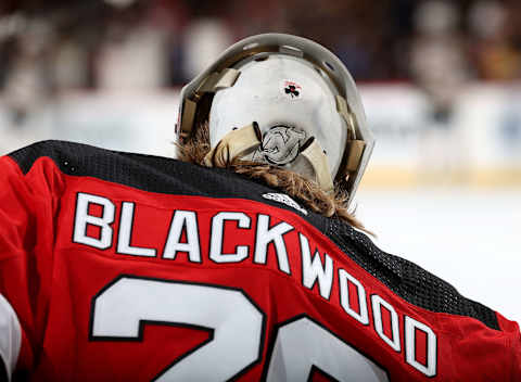
Admittedly, Brodeur and the rest of the Devils team did an awesome job with the color scheme on the logos and the numbers. The numbers and the names on the back of the jersey look especially awesome. That part of the deal looks incredible.
Some people like the stripes on the jersey, and some people absolutely hate them. I’m indifferent, admittedly. I think there are places where they look really good (on forwards shoulder pads I think they work very well). It actually works well with the piping across the rest of the jersey.
The red and the white piping crossed on the black background is what people were hoping for in the first place. These three colors in this concept looks awesome. This is the best part of the jersey, which is what makes the crest part of this so upsetting.
The authentic version of this jersey feels like it would be a great gift. The gripes with the crest seem to be my biggest issue (and a lot of other people’s issues) with the concept here. The Devils tried something different, and more times than not people will not like that. They get some props for going for something here. Did it work? Well, we’re watching this jersey for three years either way, so hopefully!