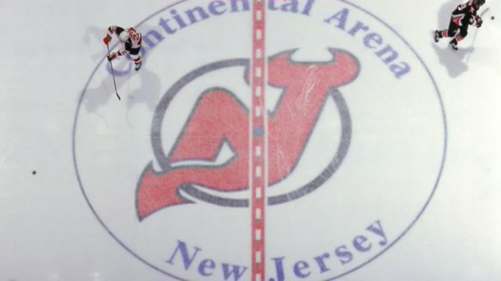
What is in a logo? It is a symbol of our team, the sigil that adorns our uniforms in battle. A logo can create new fans of a team simply because they liked it and wanted to see what team it belonged to.
Yes, that can seem pedestrian to us big sports fans, but it’s true. A logo has a lot of meaning behind it. It can create a sense of pride and tradition if it’s a good one. It can also create a cult following of insults and laughs if it’s a bad one. As New Jersey Devils fans, we were lucky to have been given a highly-regarded logo that is both simple and creative.
All Devils fans know what our logo is, but for anyone out there that may not know, let’s dive a bit deeper into the logo itself. I, myself, have been a fan of this team since I can remember and it took me well into my later single-digit years of age to realize what the logo really was. It is the letter “N” and “J” fused together to form the NJ with horns at the top and a tail at the bottom to symbolize “Devils”. One may wonder how I could have seen it as anything else but I thought the “N” part supposed to be a net and the “J” was attached to it. Don’t ask me why. Thank the Hockey Gods they didn’t stick with the prototype logo.
The Devils logo has never changed since their inaugural season in 1982-83 and is widely regarded as one of sports best logos because of its subtle and creative design. It has all of its symbolism included in one logo, which is something every franchise tries to do yet never seems to get it right.
There is something to appreciate in a team that has had one logo for the entirety (or the majority) of its existence. It means that there is tradition behind it with a sense of pride, certainly among the fan base. It brings up the thought of some other great logos in the NHL that have some of the same qualities that the Devils brings and that is creativity, simplistic, traditional and symbolic.
St. Louis:
More from Pucks and Pitchforks
- Should New Jersey Devils Try Load Management With Vitek Vanecek?
- New Jersey Devils Will Prove That Last Year Wasn’t A Fluke
- New Jersey Devils: Luke Hughes’ Playmaking Will Outshine His Mistakes
- New Jersey Devils: Chase Stillman’s Performance Causes Concern
- Can Devils Fans Separate Zach Parise Heartbreak From Achievements?
This is another logo that has stood the test of time with minor tweaks along the way. The Blues logo always remaining the same blue note. It is symbolic of the city of St. Louis and neighboring areas to the sweet rhythm of blues and jazz. It is a perfect example of a logo being integrated into the culture of a city.
Pittsburgh:
This may be unpopular with our fans, but you have to appreciate a logo that makes a skating penguin look good. On top of that, this logo has created a major sense of tradition. The Penguins five Stanley Cups have all come under this logo, even if at times the logo had different colors.
Boston:
The spoked wheel. It is an iconic logo of hockey and very unique. These days, you see logos repurposed for all sorts of things. If you have ever seen a spoked wheel logo, you knew where it originated from. It is a unique and traditional logo that is timeless. The meaning behind the spokes and wheel comes from Boston often being referred to as “the Hub”, meaning it is a hub of existence and the spokes are the arms reaching out. It’s true, look it up. This is why people from Massachusetts are so “humble”.
Calgary:
I have always loved their logo. What’s not to like? It has the “C” for Calgary and uses its nicknames of Flames in the logo as well. It is very similar in characteristics to the Devils logo. It incorporates symbolism and artistic nature yet it’s still very simple. The logo has remained intact although the primary color changes with home, away and alternate uniforms, which I think is a pretty cool twist on the logo itself.
Detroit:
This is the only logo in hockey that I will say is better than the Devils. It has everything to do with its creativity. The wheel symbolizes the city in which they are from, Detroit being the “motor city” and the wing attached to it that ties in their nickname. It’s a perfect marriage for both city and name. This is also a logo that has always remained, minor changes, yet the same all things considered.
One of the cool things about logos and aesthetics, in general, is the objectivity of it. One thing could be great on the eyes to one person and to another an absolute eyesore, therein lies the fun of it all. A team’s logo is the very image that people think of when they think of that team, to have a good one can really go a long way. Thankfully, for the Devils, they have had a classic one to go along with great success.
