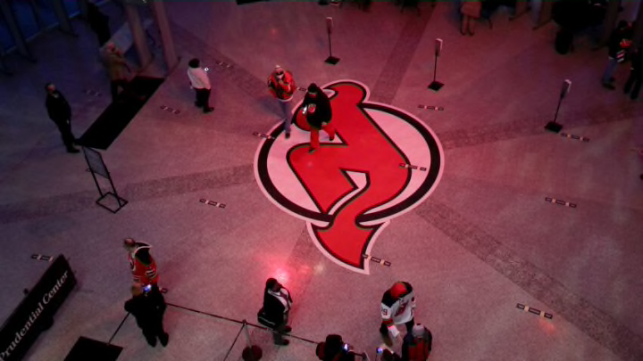
Fans, myself included, have been waiting and clamoring for a black New Jersey Devils jersey for decades now, and the franchise was always unwilling despite the obvious monetary gains it would have provided them. It was a shock to hear the team would finally be creating one. So what would it look like?
Well, black as the primary color was always a common assumption and looks fantastic especially since it would be accented by red and it might even make the logo pop out more. As for a logo, would they change it or keep the same one just with a new color scheme that did not involve green?
The options were quite open with the team name and they could have used a Devilish face like Binghamton used to or perhaps went with a big pair of red Devil wings but instead, they went the laziest most modern route they could have and just wrote “JERSEY” on it. Not New Jersey, not Devils, just JERSEY.
https://twitter.com/NJDevils/status/1463137840049668098
Teams have done this before such as the Rangers and the worst offender the Lightning and Hurricanes who creatively wrote BOLTS and CANES on a jersey. Much like this season’s new addition with the Kraken, they went the safe and lazy route putting an S on the jersey that is a tentacle instead of doing the obvious better choice an actual picture of a Kraken.
Where is the creativity? They should have taken the chance to do something unique and exciting that fans would talk about.
The symbolism on the new third uniform is better at least with it having five stripes on the shoulder, one for each retired player which is a great nod to them but does nothing to sell me on this as a good look or product that should have had millions of Devils fans lining up to buy for the holiday season. The team 100% missed the mark on this and having to wait so long for this is beyond disappointing and it is sad to see that either no one involved in this has any creativity or a high up told them no.
